Work Collection
Plan and Usage Page
Project snapshot
Designed a new section within the "Cloud Console" in order to provide more comprehensive information about plan limits; real-time storage and quota consumption. These improvements aimed to provide more transparency for customers, helping them to better manage their resources and avoid exceeding their quotas

The challenge
Customers don’t have a dedicated space in the console to check what their plan includes and how much they’ve already consumed. Without that view, they’re hit with unexpected charges, open more support tickets, and reactive capacity planning
Why we had to fix this
Product team noticed that aprox 30% of tickets were questions the console could answer if it simply exposed subscription + consumption data together. Putting that view inside the console would turn reactive questions into proactive insights.
So the goal was clear: Provide customers with their plan information within cloud console and allow them to access this information at will
APPROACH
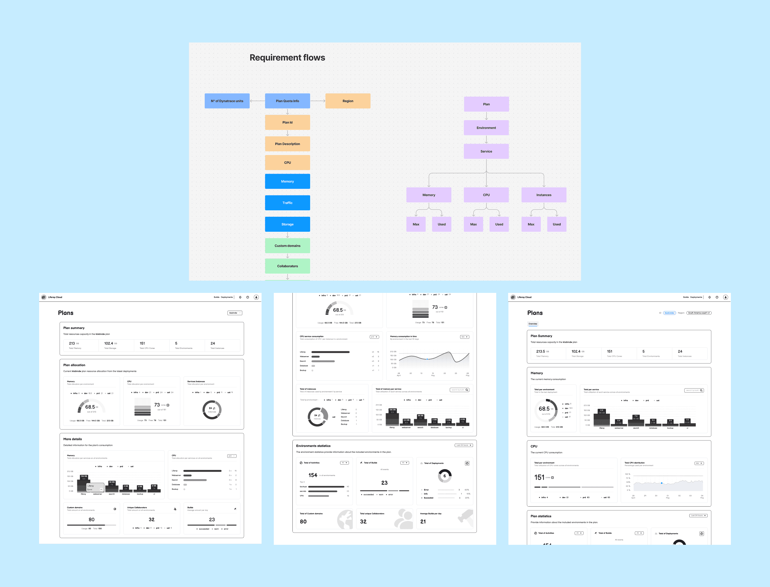
Opening the Data Warehouse
I started by listing every quota Cloud Ops and Business already track. Then I converted it into a flow diagram to show how each plan limit connects to usage for every environment and service.
Next, I grouped the data into three sections: Quick Summary, Resource Breakdown, and Extra Details and sketched rough screens for each.
A quick test with engineers and business users followed along to validate technical constrains, feasibility in terms of time/effort and scalability
The deliveries were split into three releases:
Quick Summary – One row of tiles that answers, “How much do we have and how much is left?”
Resource Breakdown – Gauges and bars for Storage, Memory and CPU
Extra Details – Cards for builds, domains, collaborators. Important, but non‑critical metrics.


What ships today
Detailed resource breakdown - Visual indicators and graphs for the main metrics, broken down by environment
Storage Consumption - The document library counter updates continuously, allowing teams to see remaining space before it becomes a constraint
Structured, intuitive layout - Critical metrics are presented prominently at the top; detailed charts and secondary data remain accessible with a single click, preventing information overload
Conclusion
The new Plan & Usage page is another step towards our efforts to provide a clearer and user friendly management at the Cloud Console. This clarity reduces unexpected extra charges and support requests, while enabling more deliberate capacity planning.